
How to Stand Out Online: The Quiet Luxury Blueprint for High-Ticket Brands
Standing out online is not about making more noise.
In fact, the loudest brands often look the most unsure of themselves. During my decade as a corporate Vice President of Sales, Marketing, and Merchandising, I watched companies spend millions splashing neon banners across crowded retail aisles. They assumed volume equaled distinction. Yet discerning buyers consistently walked right past them to choose quiet, confident brands.
Today, established female founders, boutique practice owners, and corporate advisors run into this exact wall. You possess decades of specialized mastery. However, your digital presence looks just like everyone else in your industry.
Psychologists study this human response as cognitive ease. When a digital layout feels clean and effortless, our brains naturally interpret that clarity as competence and safety. Conversely, when a page feels cluttered or jarring, cognitive strain spikes. The brain reads that friction as operational risk.
To stand out online, you don’t need gimmicks. You need three foundational elements working in harmony: intentional brand imagery, disciplined brand colors, and persuasive sales copy.
1. Eliminate Stock Photo Invisibility
Most professional service websites suffer from visual sameness.
You know these pages immediately. They feature a staged laptop on an empty desk, or two strangers shaking hands in a sterile boardroom. Because prospective clients see those identical images everywhere, their eyes simply slide off the screen.
High-performing brands command attention with editorial, European-chic art direction. They pair generous negative space with crisp, high-contrast focal points.
- What Blends In: A generic stock photo of a corporate meeting room. It signals entry-level services.
- What Stands Out: An editorial architectural vignette with natural light, rich depth, and generous breathing room
2. Brand Colors: The Power of Intentional Subtraction
When founders attempt to differentiate their business, they often choose five or six vibrant colors. Yet elite positioning is an act of reduction, not addition.
Insecure brands add visual elements because they fear being overlooked. In contrast, authoritative brands use restraint, generous whitespace, and high-contrast palettes to guide the eye.
Consider this practical comparison:
- The Cluttered Approach: Stacking competing bright pinks, yellows, and purples on one landing page. It strains the reader’s focus and causes visual fatigue.
- The High-End Approach: Grounding your layout in crisp snow white, rich charcoal black, and champagne gold, punctuated with a single intentional stroke of fuchsia.
As behavioral research published on Think with Google highlights, visual complexity drives prospective buyers away within the first three seconds of landing on a digital page. Clean contrast holds attention because the brain does not have to expend mental energy deciphering the page.
3. Typographic Hierarchy: The 3-Tier Authority Formula
Typography serves as the structural foundation of digital trust. Yet many founders rely on a single generic font across their entire site.
A single font flattens your message, while five mismatched fonts create chaos. To command executive respect while maintaining effortless reading ease, your brand needs a disciplined trio:
Stand Out Online Typography Hierarchy
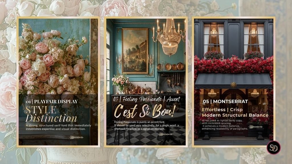
01 | Playfair Display: Style Distinction
Your title font establishes your category authority. We anchor this system with Playfair Display. Its sharp transitional serifs and high contrast deliver immediate editorial prestige and visual distinction. It commands attention without having to shout
03 | Feeling Passionate: The Selective Accent
Restraint gives power to expressive typography. Feeling Passionate is purely a spark accent font. It should be used very selectively for a single focal word, a short sub-headline, or a signature element. Think of it as a subtle gold accent on architectural molding—one stroke elevates the entire composition.
05 | Montserrat: Crisp Modern Balance
If your headline commands respect, your body font must deliver transparent efficiency. Montserrat provides an effortless, modern balance. When set in lighter weights with increased letter spacing, it maximizes paragraph readability across desktop and mobile screens alike.
Before finalizing your typography and color codes, your brand requires visual room to breathe. Discover why high-fee advisors strip away noise first in how to stand out online with quiet authority.
The Fast Track to Quiet Luxury Visuals
One font alone flattens your message. However, five mismatched fonts create chaos.
To command category respect, you need a disciplined three-tier hierarchy.
Therefore, our 17 Free Editable Canva Font Trios are pre-styled, high-contrast, and ready to drop into your Canva account today.
Enter your details below to open your toolkit:
4. Persuasive Sales Copy: Bridging the Perception Gap
Polished visuals and balanced fonts create an executive container. However, your words must close the sale.
Many brilliant female founders hit a persistent revenue ceiling because their copy hides behind sterile corporate speak. They write about “holistic methodologies,” “synergistic operational alignment,” and “transformational paradigms”. While these phrases sound formal, they fail to spark a buying decision.
In his book To Sell Is Human, Daniel Pink shows that moving others requires genuine clarity and attunement. Buyers trust service providers who state the exact problem plainly and map out a simple, frictionless path forward.
- Sterile Corporate Copy: “We leverage synergistic methodologies to facilitate transformational executive paradigms.”
- Persuasive Sales Copy: “We rebuild your digital architecture, so high-ticket advisory clients trust your expertise in the first 30 seconds.”
Claim the Exact Copy Templates That Command High-Ticket Trust
The Editable Canva Copywriting & Hierarchy
Writing high-ticket sales copy does not mean starting from an empty page. When you combine disciplined visual hierarchy with clear, conversational narrative, your value becomes undeniable. To help you bridge that perception gap without the structural guesswork, I packaged our signature editorial layouts into a plug-and-play toolkit.
The difference is immediate. The second example names a concrete outcome using crisp, everyday words. If you want to dive deeper into page experience standards, review Google Search Central’s guide on core web page experience, which proves that effortless reading directly improves on-page user engagement.
The Verdict: Make It Effortless to Say Yes
Learning to stand out online isn’t about chasing trends. It is an intentional commercial strategy.
When you combine editorial photography, disciplined color palettes, structured typography trios, and crystal-clear copywriting, you bridge the Expertise-to-Perception Gap. Your digital presence finally matches your professional caliber.
Clients stop questioning your rates. Instead, they book consultations ready to partner with an established authority.
Warmly,
Suzanne Dufault
Brand Strategist & Creative Director
suzannedufault.ca
P.S. Coffee Break Visual Audit
Open your website on your phone right now. Step away from your desk and glance at your screen for five seconds.
Does your homepage breathe with generous white space and distinct hierarchy? Or does it feel like a wall of crowded text and competing fonts?
If your mobile site feels dense, your prospects feel that friction too. Take fifteen minutes today to review your typography and messaging using our Executive Brand Alignment Resources.