
Website Architecture for Premium Brands: Why Most Sites Fail to Sell Without Shouting

Building a website architecture for premium brands requires a fundamentally different philosophy. High-end clients do not want a carnival. Instead, they seek calm confidence, clear structure, and frictionless direction.
During my years as a corporate Vice President of Merchandising, I watched retail brands spend fortunes trying to scream louder than their competitors. They covered store windows with neon promotional signs. They stacked shelves to the ceiling with competing visual noise. Yet, the luxury boutiques down the boulevard did the exact opposite. They offered wide aisles, quiet lighting, and curated space. They sold far more by saying far less.
Today, online businesses make that same noisy mistake with their web layout. They install animated pop-ups, flashing banners, and confusing menus. Consequently, high-value clients leave immediately.
Here is how you engineer a digital flagship that commands respect and sells with quiet authority.
1. Intentional Space in Premium Brand Website Architecture
Most creators fear empty space on a web page. Therefore, they pack every inch with widgets, badges, and redundant copy.
In luxury retail, space equals value. When a boutique places one handbag on a marble pedestal, you immediately understand its worth. In contrast, bargain bins force shoppers to rummage through clutter. Your digital layout functions like that showroom floor.
When you introduce generous white space around your core proposition, your message breathes. Readers process your value faster. Visual restraint also sets you apart from generic competitors.
– Do this: Frame one core value proposition with generous margins and clear breathing room.
– Not that: Cram five competing banners and pop-up discounts into the first screen fold.
2. Structural Typography: Guide the Eye in Three Seconds
Design communicates value before a visitor reads a single sentence. When you land on a poorly structured website, your brain feels overwhelmed. As a result, you click away.
A modern brand architecture relies on disciplined typography hierarchies:
– The Editorial Hook (Playfair Display): Conveys editorial elegance and legacy credibility in your primary headings.
– The Clear Guide (Lato): Delivers effortless legibility for subheadings and feature calls.
– The Functional Reader (Inter Light): Keeps body paragraphs light, clean, and modern.
This disciplined combination eliminates visual clutter. As behavioral researchers note, cognitive ease creates emotional trust. So clean typography doesn’t just look refined; it speeds up client decisions.
3. High-Performance Infrastructure Over Bloated Plugins
A beautiful design fails completely if your infrastructure runs slowly. Modern search algorithms and discerning clients share one common trait: neither waits for a slow site to load.
As the technical documentation at Google Search Central confirms, page experience and performance signals directly determine whether your site earns visibility or loses visitors to friction. Many service providers load dozens of conflicting plugins. Consequently, their page speed collapses.
To build a high-performance digital flagship in 2026, keep your foundation lean and modern:
1. Enterprise-Grade Hosting (Hostinger Cloud): When building a high-performance website architecture for premium brands, keep your technical foundation lean and modern:
2. Ultra-Light Theme Architecture (Astra Pro): Provides structural flexibility without heavy, bloated code.
3. Block-Based Visual Layouts (Spectra Pro): Delivers bespoke editorial layouts natively within the WordPress block editor.
4. Seamless Commerce (WooCommerce): Powers streamlined checkout flows for strategic diagnostics and digital packages.
When your tech stack stays lean, your website feels instant, responsive, and polished.
4. The Clear Architecture Path: High-Converting Premium Brands
Most websites fail because they ask visitors to make twenty decisions at once. They invite visitors to read the blog, browse templates, follow social accounts, and book a call at the same time. When you present too many options, clients choose nothing.
Next Steps: Audit Your Digital Flagship
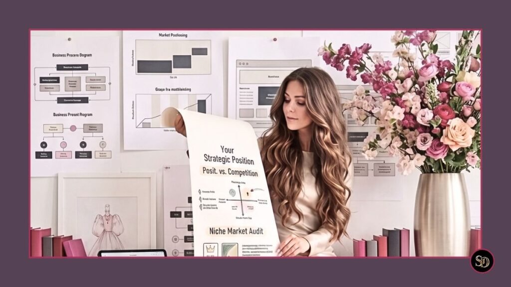
In person, your authority is obvious. Online, however, weak website architecture costs you high-caliber clients. I audit your digital foundation to fix credibility leaks, remove visual friction, and help you command premium fees.
- L’écart d’alignement : Generic website layouts hide executive depth. I restructure your user journey so your real-world stature is impossible to miss.
- Le coût caché : Discerning decision-makers evaluate your site in seconds. A cluttered, sluggish site quietly sends premium clients straight to competitors.
- Le résultat : A rigorous structural review of your online presence that uncovers what is costing you conversions and restores your true pricing power.
You can easily bridge this gap.
Through my $350 CAD Luxury Growth Audit, we review your entire digital flagship together:
A comprehensive architectural audit of your complete online presence to eliminate positioning leaks, streamline user flow, and convert visitors into high-value clients. Delivered in 3–5 business days.
Stop shouting with digital clutter and start commanding quiet authority.
Book Your Executive Audit Diagnostic
Warmly,
Suzanne Dufault
Brand Strategist & Former Corporate VP
The Strategy of a VP. The Soul of a Designer.
P.S. During my years as a corporate Vice President of Merchandising, I learned that luxury brands never scream; they let intentional space and disciplined structure do the selling. I do not just design pretty pages; I engineer digital website flagships that convert.
Here is a quick challenge for your next coffee break: pull up your website on your phone. Does the layout convey the calm confidence of an industry authority within three seconds, or does it feel crowded and noisy? The answer is usually eye-opening. Tell me what you see—send a quick note to sue@suzannedufault.ca.