

Strong brand foundations decide whether clients treat you like an elite advisor or a discounted commodity.
Years ago, on our retail showroom floor, we staged a gorgeous French linen armchair. Beside it sat a single side table with one solid marble lamp. The entire vignette felt calm, effortless, and undeniably expensive.
Across the aisle, another vendor shoved fifty assorted pillows into metal discount bins. Shoppers walked right past those bargain bins. They marched straight to the armchair and paid full retail price without flinching.
High-paying buyers do not want an obstacle course. They crave visual clarity.
When your website throws four conflicting fonts and looping scripts at visitors, it feels like that metal bargain bin. Messy layouts signal hesitation before you ever say hello. As we explored in our guide on how to stand out online by staying quiet, disciplined design builds instant trust.
The Executive Quick-Start: Want to clean up your visual presentation today without losing your weekend? Start with your fonts. Grab our free Quiet Luxury Typography & Layout Guide: 17 Free Canva Font Trios. It gives you tested, high-contrast font pairings you can drop into Canva right now for an instant, boardroom-ready presence.
7 brand foundations every female founder needs to drop price resistance and command high executive fees.
1. Page Layout: The First of Your Brand Foundations
Most websites fail because they feel like chaotic flea markets.
They feature ten navigation links, surprise pop-up boxes, and four competing buttons. As a result, busy decision-makers throw their hands up and leave.
High-value positioning relies on a one-door layout. You welcome your visitor, state the exact problem you solve, and offer one clear front door.
- What looks amateur: Eight navigation tabs, two auto-sliding banners, and three different buttons shouting for attention.
- The executive fix: A confident headline, two clear sentences explaining who you help, and one button: Schedule an Initial Consultation (or View Recent Projects).
- The result: Clear direction removes the guesswork and attracts serious clients before they ever hit send.
2. The High-Contrast Color System
Many smart business owners fall headfirst into the pastel trap.
They pick four whisper-soft shades of beige, blush, and foggy gray. Because on a screen, low contrast makes reading your brilliance feel like squinting in the dark. If reading feels like homework, high-paying clients click away.
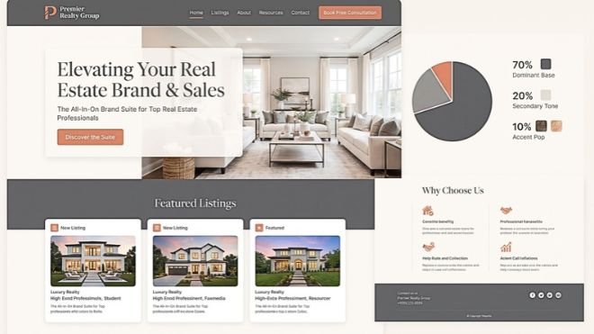
Real authority requires grounding. You only need a simple three-part color system to keep your message sharp and readable:
- The Grounding Base (70%): A crisp, bright canvas (like warm alabaster or pure white) paired with dark, readable text (like deep charcoal or slate).
- The Structural Anchor (20%): A tailored classic tone for section containers and borders (think rich midnight navy or deep espresso).
- The Signal Accent (10%): One decisive pop of color reserved strictly for buttons and key moments (like warm terracotta or deep cognac).
For example, an advisory firm using clean white, deep slate text, and a warm cognac button immediately looks seasoned. Readers can relax and focus on your expertise.
3. Executive Typography: Core Brand Foundations for Clarity
Decorative clutter signals operational panic.
When you mix swirling calligraphy fonts with three different display styles, corporate leaders lose patience. High-caliber clients scan before they read, and clean type looks like competence.
You only need two classic, free fonts doing two specific jobs:
- Pairing Option 1 (The Editorial Standard): Use Cormorant Garamond (Free in Canva) for titles, paired with Open Sans (Free in Canva) for body text. This duo delivers quiet elegance and reads beautifully on phones.
- Pairing Option 2 (The Modern Authority): Use DM Serif Display for headlines and DM Sans for paragraph copy. Both fonts look balanced, sharp, and straight out of a top-tier business journal.
- Pairing Option 3 (The Heritage Classic): Use Libre Baskerville for bold headings and Source Sans 3 for body copy. This pairing brings traditional trust and crisp screen clarity.
When your typography stays clean, your pricing feels justified before a prospect even opens your proposal.
4. The Lived Authority Biography
Most executive “About” pages read like stiff, dusty resumes.
They list acronyms, credentials, and corporate buzzwords. But real clients do not hire certificates. They hire your seasoned judgment under pressure.
Think of your story like a great dinner party conversation. If someone says, “I leverage synergistic operational paradigms to optimize enterprise ROI,” you quietly slide away to find the snack table.
Instead, tell them what you broke, what you fixed, and what you learned:
- What sounds generic: “Results-driven strategic visionary leveraging synergistic operational paradigms.”
- The lived authority fix: “Over 20 years on the commercial retail floor, I learned that when you try to sell everything to everyone, you end up competing with everyone on price. The turning point came when we took a red pen to our catalog and axed 40% of our low-margin clutter. The result? We stopped running ourselves ragged, and our bottom-line profits doubled. Today, I teach smart female founders how to clear out the menu noise and build clear positioning that makes discounting obsolete.”
Speak like a human. Real authority never hides behind jargon.
5. Merchandising Your Offer Suite: Essential Brand Foundations
In retail merchandising, keeping slow-moving dust-collectors on the main floor kills your store reputation.
As founders, we secretly assume adding more stuff equals helping more people. When revenue slows, our gut screams to create another tier, tack on a mini-package, and build another checklist.
Behavioral science and decades of showroom floor numbers prove the exact opposite. When people face too many choices, their brains hit the brakes. They don’t buy the cheaper item; they freeze and leave without buying anything.
Clean up your business by spotting the clear winners and deleting the losers:
- Audit your current roster: Tuck away the confusing mini-services, random add-ons, and hourly packages.
- Spotlight the main event: Steer every serious conversation into one initial discovery diagnostic.
- Build a calm client path: Use that first diagnostic to check mutual fit before revealing your full flagship engagement.
- What looks amateur: A pricing page with seven packages ranging from tiny one-off tasks to retainers, leaving clients baffled.
- The executive fix: One flagship solution that takes the client from a painful problem to a clean victory.
- The result: When you cut the clutter, your primary service shines like fine art in an open gallery.
6 Ways to Structure a Single High-Value Offer:
- The Executive Leadership Coach: Skip the one-off 45-minute pep-talk calls. Offer one path to an Initial Leadership Diagnostic.
- The Fractional Chief Financial Officer (CFO): Ditch the laundry list of hourly bookkeeping and cleanup tasks. Offer one entry point to a Financial Health Audit.
- The Commercial Interior Design Studio: Stop offering piecemeal paint consultations and shopping afternoons. Invite clients to one Project Feasibility Assessment.
- The High-End Operations Consultant: Replace a 10-page menu of software setups with one Comprehensive Operations Review.
- The Private Wealth & Tax Advisor: Retire the overwhelming list of twelve separate forms. Offer one Initial Estate Portfolio Audit.
- The Boutique Web Strategy Firm: Stop selling logo tweaks, plugin updates, and single-page edits as one-offs. Invite clients to apply for a Complete Website Discovery Session.
6. Visual Search Discovery: Pinterest for Brand Foundations
Social media algorithms are like needy toddlers: they demand attention every single hour.
Take a week off to serve clients or catch your breath, and your visibility vanishes. In contrast, visual search engines like Pinterest index your smart ideas forever.
Here is the secret most business coaches miss: people do not use Pinterest like Instagram. They do not open the app to watch creators dance. As we analyzed when breaking down how search engines recommend authoritative brands, users arrive with high search intent and look for structured solutions to real problems.
Before you spend hours writing, verify demand on Google Trends to see what people actively search for. Google Search Central guidelines also confirm that search systems reward structured, original expertise over superficial social trends.
Where to Find Real Pinterest Keywords (Without Guessing):
If you look in the wrong place on Pinterest, you will hit a brick wall:
- The Rookie Mistake: Browsing Pinterest Shopping Trends. That tool only tracks physical retail items like lip balm, boots, and holiday wreaths. If you offer professional services or digital frameworks, it will tell you your category does not exist.
- The Insider Shortcut: Head directly to the Pinterest Trends Tool. Type your core topic into the search bar and watch the real data appear. You will instantly see seasonal curves, demographic breakdowns, and the exact search phrases real humans use.
- The Translation Rule: Pinterest users speak in visual and identity terms, not corporate board language. While Google loves search terms like brand strategy, Pinterest users search for branding, personal branding, brand identity design, and corporate chic. Meet them where they already search, then use your smart frameworks to qualify them.
The 3-Step Visual Discovery Pipeline:
- Design clean, high-contrast pins that showcase your frameworks without fluff: Skip the generic stock photo of someone laughing at a salad. High-caliber clients do not click on lifestyle daydreams; they click on clarity.
- What looks amateur: A pale beige pin with script font that whispers: “5 tips to align your mindset for business abundance.” Nobody can read it on an iPhone screen, and nobody knows what it means.
- The high-contrast fix: A deep charcoal pin with crisp typography that outlines a real checklist: “The 3-Part Retainer Diagnostic: How Fractional CFOs Eliminate Scope Creep.”
- Curious what quiet authority looks like in the wild? Pop over to my visual studio on Pinterest to see how we use high-contrast checkerboard boards, deep neutrals, and clean editorial covers to stop the scroll and turn casual searches into serious client conversations.
- Link every pin straight to your long-form educational articles: Never drop a searcher onto a dead-end homepage or a confusing link tree. When someone clicks a pin about solving pricing pushback, take them directly to the exact article answering that question.
- What looks amateur: The pin promises a framework for executive bios, but the link dumps the reader onto a generic sales page screaming “Buy my $97 course today!” They bounce within three seconds.
- The executive fix: The pin links directly to your in-depth guide where the story, the diagnostic steps, and the real-world examples wait in clean, scannable type.
- The result: A direct bridge builds trust instantly because you honored the exact promise on the graphic.
- Turn visual searchers into loyal subscribers while you sip your morning coffee: A great pin does not ask for marriage on the first date. It invites the reader to take the next sensible step.
- What looks amateur: Begging visitors to “Join my weekly newsletter for updates!” Nobody wakes up wishing for more generic newsletters.
- The executive fix: Offer a specific tool that speeds up their day, such as a 1-page scope-of-work checklist.
- The result: While you pour your morning coffee or review client work, your visual pins work silently in the background, introducing your lived authority to fresh eyes day after day.
7. The Executive Media Kit & Pitch Asset
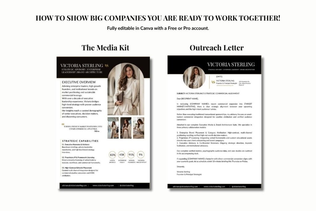
When corporate brands or institutional partners evaluate your business, they expect clean documentation.
A sloppy email or bloated slide deck can damage your credibility in seconds. Instead, package your brilliance into a crisp, one-page media kit.
As we walked through in our complete guide on how to build an influencer media kit, an executive asset only needs three elements:
- A Clear Positioning Statement: Who you help and the exact operational headache you cure.
- Real Audience Demographics: Proof of decision-maker trust rather than fluffy vanity numbers.
- Clean Partnership Tiers: Clear collaboration options that make saying yes completely painless.
When your brand foundations align across your layout, colors, and media kits, price resistance simply evaporates.
Frictionless Implementation and Next Steps for Your Brand Foundations
AI will not reward the loudest founder in the room. It will reward the clearest one.
Stop chasing every fleeting trend or shouting on platforms that drain your energy. Instead, build a reputation that Google understands, clients remember, and AI trusts. That is personal branding at its finest: quiet, specific, and backed by undeniable proof.
Take a quick 30-second check today. Google your name. Then ask an AI tool who solves your ideal client’s biggest challenge. If your business is missing from that answer, you do not have a capability problem. You have a perception gap.
When you anchor your expertise to solid brand foundations, you stop competing on price and start commanding the respect your career has earned.
Warmly, calm confidence,
Suzanne Dufault
sue@suzannedufault.ca
suzannedufault.ca
P.S. Coco Chanel once said, “Simplicity is the keynote of all true elegance.” (And let’s be honest, she was definitely not pairing three swirling script fonts with neon buttons!) If you scrolled straight to the finish line, don’t leave empty-handed—pop back up to the top and grab our 17 Free Canva Font Trios so you can give your brand that calm, expensive boardroom presence before the weekend hits.